antony clarkson
  • CODEX
    • plane >
      • Apophenia: An Uncanny Presence.
      • Control(s)
      • Personal Topographies
      • The Self-Isolation Residency
      • Americana
      • Mauve Skies
      • Scotland
      • Selected Drawing & Paintings,
      • The Teaching Years
      • Spatial Paintings 2006-2008
      • Paintings 2006
    • mass >
      • The Blind Men and the Elephant.
      • Spatial Conceptions 2014 - 2022
      • Painted Objects
      • Autograph
      • The Newtonian Nightmare
    • volume >
      • Enso nest
      • Someone else's storey
      • Shower, The Process Residency 2013,
      • Concrete Haiku
      • Atypical
      • The Murder of Crows.
      • Composition in White (Painting), The Breathe Residency:
      • Composition in White (Sculpture), The Breathe Residency:
      • Floorplan
      • Paper Scissors Rock
      • Pilgrimage
      • The Fifth Column
      • Tension
      • Arch
    • blogs >
      • The Self-Isolation Residency: Blog 2020-2021
      • Apophenia: An Uncanny Presence. 2022
    • artist statement
    • cv & education
    • contact

The Athole House Studio
Self-Isolation Artist Residency
30th March 2020 - 7th November 2021

​

Picture
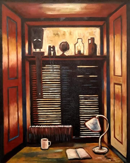
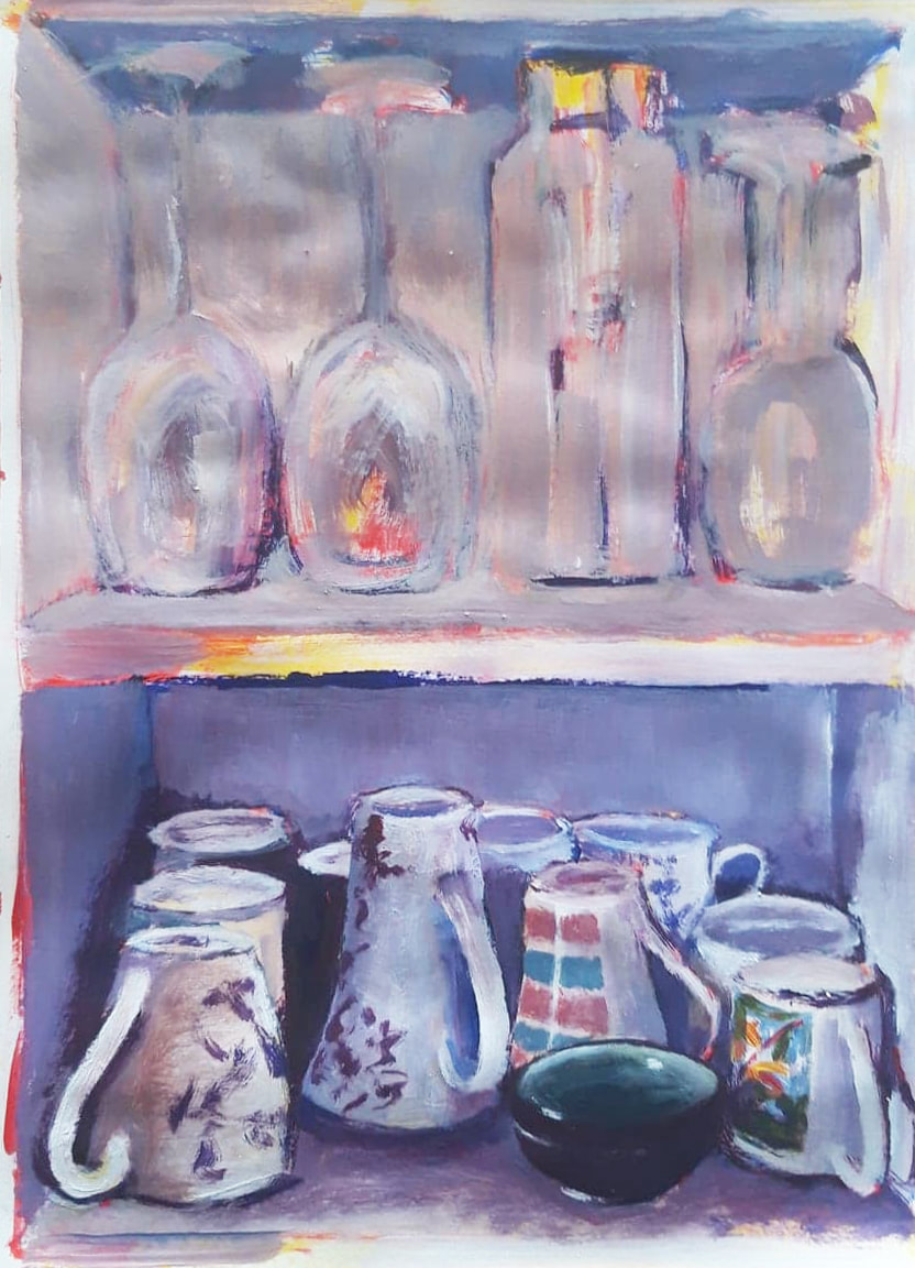
Over my career I have taken part in many artist residencies in various parts of the world; I have even organised and run a residency program myself. 2020 has brought new challenges to us all, I however intend to treat these challenges as opportunities. With this in mind today, the first day of my self-isolation having arrived back from my studio in the Untied States last night, I I launch my new blog which will become an integral part of this website as I redesign is over the coming weeks.

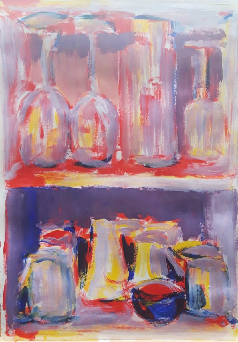
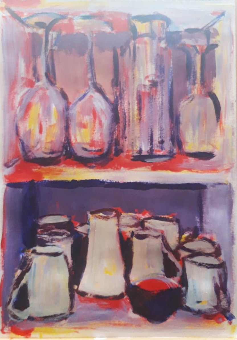
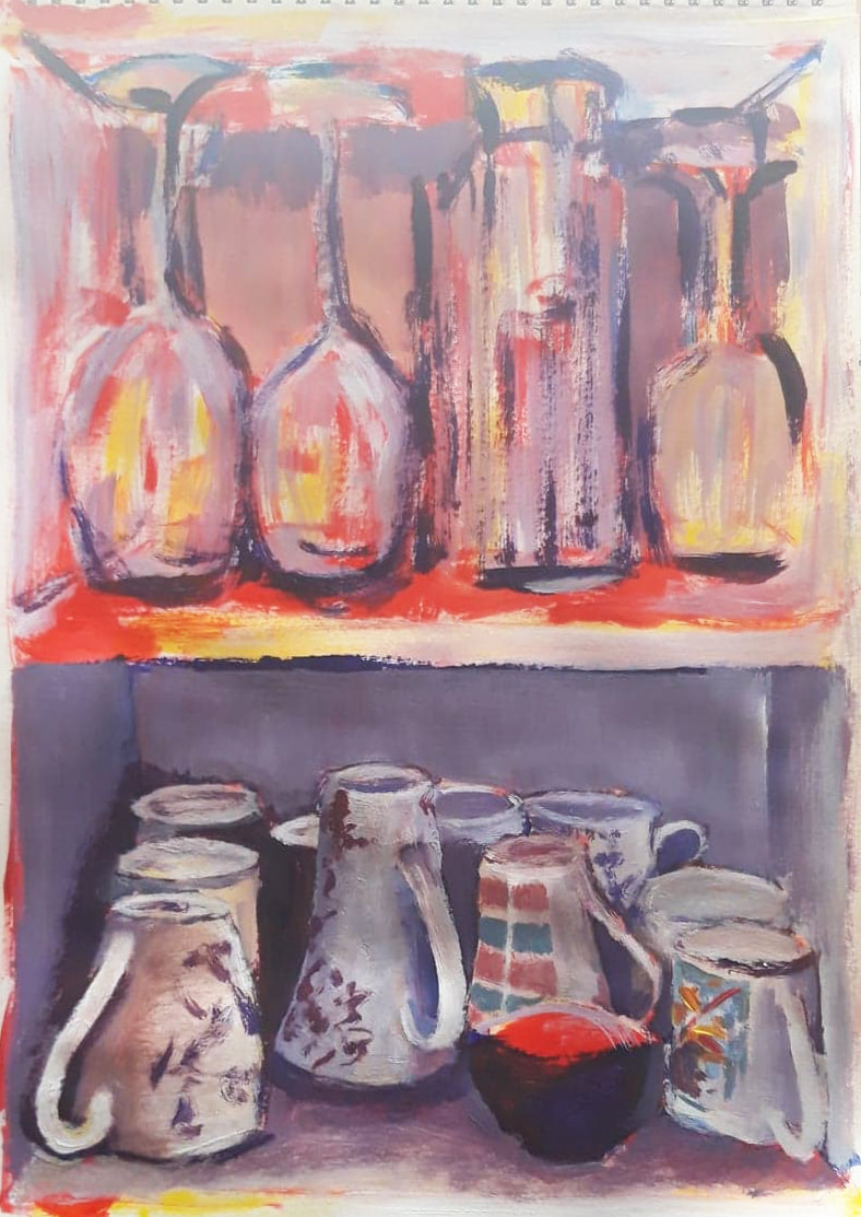
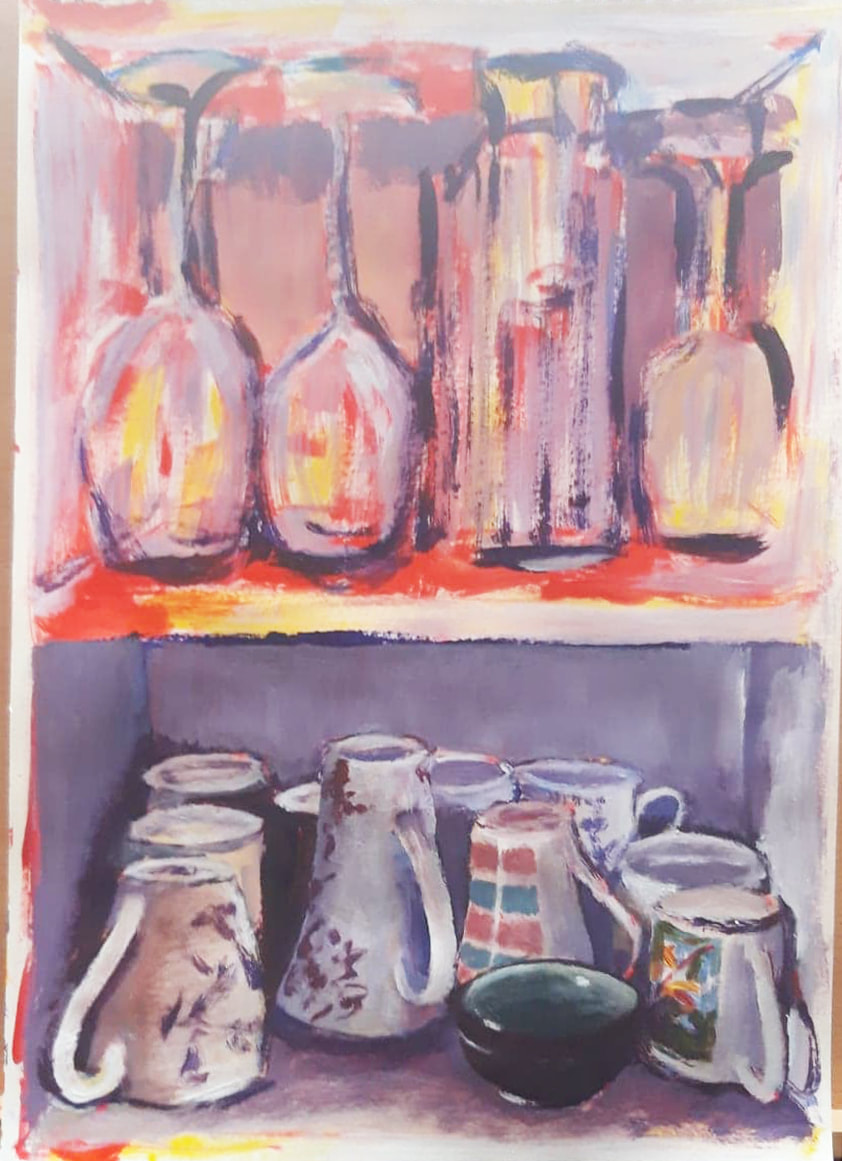
Artist Residencies give artists the space and perhaps more importantly the time to make new work; I intend to treat my time in self-isolation in the same way that I would if I were on an artist residency in another studio in another part of the world. Athole House Studio maybe one of my home studios but for me it is a work space, and lets face it, we all now have the time.

The Self-Isolation Residency 14th may 2020: Day 46

5/14/2020

0 Comments


Photo-story No.1 :'Opacity', the creation of a painting in photos.

Picture

Image 1.

Picture

Image 2.

Picture

Image 3.

Tonight I have something a little different, whilst I have been working on my latest painting in the 'kitchen-sink series', that is un-posed still lifes, I have photographed the painting at relevant intervals to try to demonstrate how the process of painting something like this can by achieved.  The subject for this painting is a simple one, the kitchen board where I keep my wine glasses and cups. The painting is done in acrylics and the colours used are: Cadmium red, Cadmium yellow. Ultramarine and Titanium white. No other colours and no blacks is used.

Image 1. I think that this is fairly self explanatory, but I will just mention a couple of things. There is no sketching in pencil used in the painting, everything is sketched in loosely in cadmium red, I began by establishing the position of the middle shelf, just less that half way up the painting. The glasses were sketched in next, the proportions of them came to the centre of the image, these 2 proportions allowed me to measure the placement of all the other components of the painting.

Image 2. Once the rough sketch was in place I stated to block in tonal areas using the yellow, red and blue as my light, medium and dark tones. Firstly the yellow for everything that would be palest. 

Image3. The same process of blocking in continued with the red and the blue. As you can see everything is kept very loose at this stage, don't stress too much about precision at the early stages of a painting, its psychologically much easier to make corrections to a painting in the early stages if you haven't laboured on too much detail which you later have to paint over.  This would possibly be the most difficult part of this process for many people, the painting can look quite confused, but don't worry, remember all you are trying to do is create tonal areas at this stage.

Picture

Image 4.

Picture

Image 5.

Picture

Image 6.

Image 4. This is the point where you will start to see more form come into the painting, I'm now introducing the white for the first time, but I'm actually introducing it as a form of greys. These greys are created by mixing very small amounts of a purple made from my red and blue into the white, on this occasion slightly more blue that red was used to achieve the greys I desired. These 'greys' start to give the objects and spaces form and solidity.  Very pale greys are used on the cups and glasses whilst darker ones are used to help define the basic space of the cupboard and shelves. 

Image 5. As I mentioned previously there is no black used in the painting, on the whole I never use black, it is unnecessary and detracts from the final painting because of its 'flatness'. But At this stage I am starting to add the very darkest areas, so once again I return to my purple but this time a pure mix of red and blue without any white added. On most occasions this purple will give you the darkest areas that you need, if it doesn't look dark enough consider using darker reds and blues like alizarin crimson and prussian blue.

Image 6. Once the basic forms have been solidified with the tones, lights and darks you can start to add a little detail. Detail is quite a subjective thing in a painting, some people like a lot some a little. Often too much detail weighs a painting down so I personally resist it, I just add enough to explain what is happening. I would say that this is an area that you will need to experiment with, but generally bare in mind that less is probably more.

Picture

Image 7.

Picture

Image 8.

Picture

Image 9.

Image 7. The final details have been added to the cups now, there is very little green in this whole painting, the only real area is the inside of the small Japanese cup, because of this I left the green until most of this area was complete so that I could balance the green that I needed. Greens can be difficult in paintings like this as they can be 'jarring', however if the green is mixed from the same yellow and blue as the rest of the painting, as it is here, it should harmonise without any problem.

Image 8. I now started to apply exactly the same process of detail and form to the glasses with the pale grey that I did to the cups. People think glasses are difficult to painting, but the thing to bare in mind is that they are transparent, so most of the time you are actually just painting what is behind them with some highlights and shadows added.

Image 9. Having added the palest 'grey' areas to the glasses I next proceed to add the darkest with the deepest purple. I also took this opportunity to darken some of the shadows in the background space.

Picture

Image 10.

Picture

Image 11.

Picture

Image 12.

Image 10. Now I'm into the final sections of the painting, balancing and re-balancing. Adding just a highlight or reflection here and a shadow there. Any extra details required can also be added at this time.

Image 11. Time to step back and review things; is there anything needed to complete or correct the image? Yes, on this occasion the cup handles needed some extra shadow to give them more form. I also decided to warm up some of the background area around and behind the glasses.

Image 12. Final review, not really very much to do be it was worth checking. Just a few extra touches to finalise lines here and there on the glasses and shelf edge and to darken some shadows a little more for contrast, but that was really it, the painting is finished..
0 Comments


Leave a Reply.

    Archives

    November 2021
    October 2021
    September 2021
    August 2021
    July 2021
    June 2021
    May 2021
    April 2021
    March 2021
    February 2021
    January 2021
    December 2020
    November 2020
    October 2020
    September 2020
    August 2020
    July 2020
    June 2020
    May 2020
    April 2020
    March 2020

    Categories

    All

    RSS Feed

Proudly powered by Weebly
  • CODEX
    • plane >
      • Apophenia: An Uncanny Presence.
      • Control(s)
      • Personal Topographies
      • The Self-Isolation Residency
      • Americana
      • Mauve Skies
      • Scotland
      • Selected Drawing & Paintings,
      • The Teaching Years
      • Spatial Paintings 2006-2008
      • Paintings 2006
    • mass >
      • The Blind Men and the Elephant.
      • Spatial Conceptions 2014 - 2022
      • Painted Objects
      • Autograph
      • The Newtonian Nightmare
    • volume >
      • Enso nest
      • Someone else's storey
      • Shower, The Process Residency 2013,
      • Concrete Haiku
      • Atypical
      • The Murder of Crows.
      • Composition in White (Painting), The Breathe Residency:
      • Composition in White (Sculpture), The Breathe Residency:
      • Floorplan
      • Paper Scissors Rock
      • Pilgrimage
      • The Fifth Column
      • Tension
      • Arch
    • blogs >
      • The Self-Isolation Residency: Blog 2020-2021
      • Apophenia: An Uncanny Presence. 2022
    • artist statement
    • cv & education
    • contact